Dye no more—Montana Inspired Easter Egg

I was approached by Food Network Magazine a few months ago with an interesting challenge—create an Easter egg inspired by my home state. No restrictions on the medium used.  Ack! What to do? The first picture that popped in my head was an elaborately painted landscape with a big bull elk at the center. (Well they contacted the wrong person for that). Instead I proposed something that was a little more me—a modern wheat design that is inspired by the pattern I created for my blog background.  They loved the idea and told me to go for it. 

IMG_0153.jpg

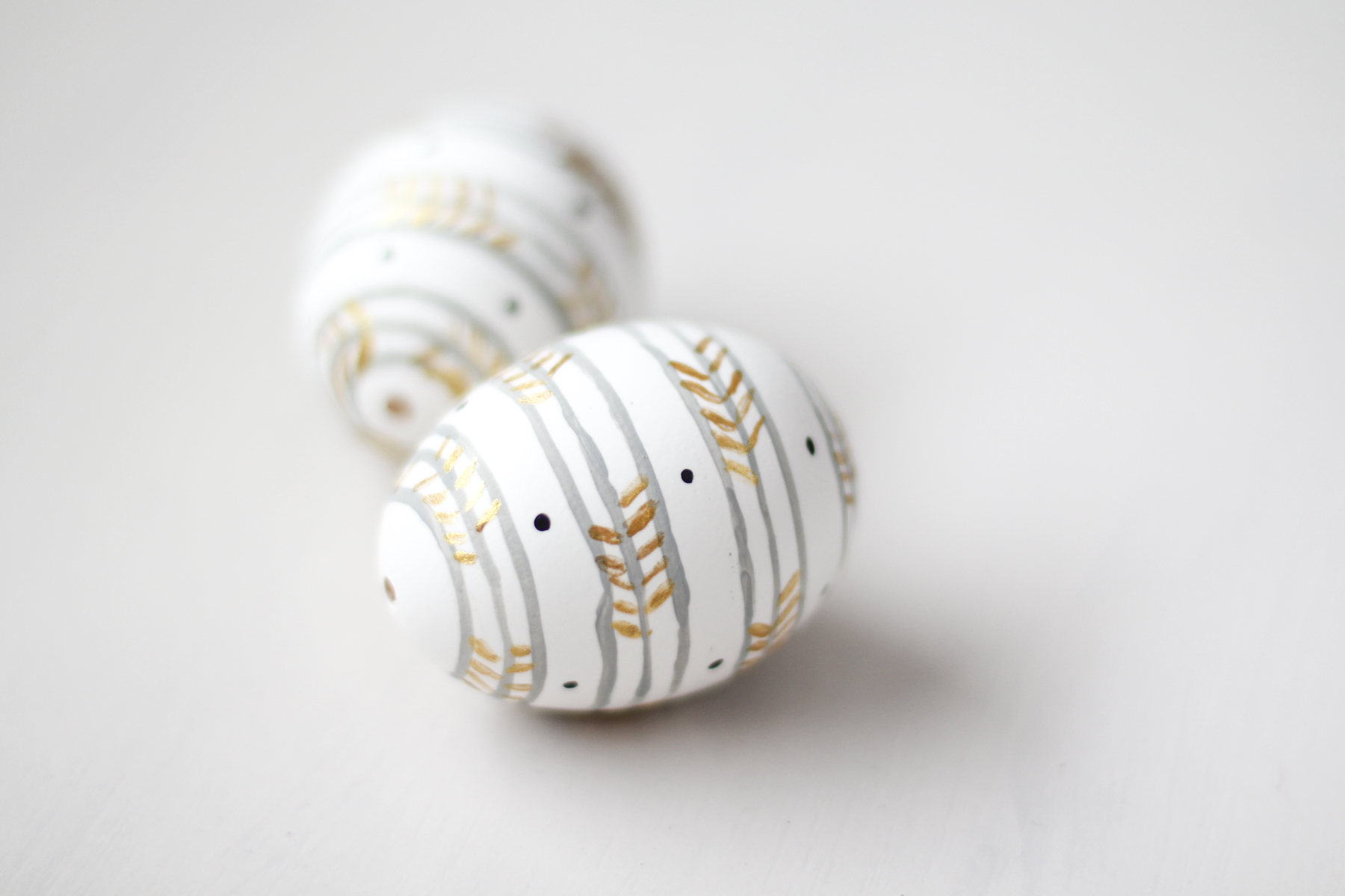
This project caused me no little stress (because Food Network Magazine—doh!) I probably went through a dozen eggs trying to nail the perfect design before I went back to my original idea and just embraced the imperfect, hand-painted quality. 

Trying to paint straight lines on a round egg is... well, crazy. But let me show you a little trick I used. 

I drilled perfectly round holes in each end of the egg first using a Dremel tool. I used these holes to blow out the egg.  Then, I fitted a skewer through each hole and attached mini rubber bands around each end to secure it in place. Then I rested the skewer over a bowl so I could rotate it evenly as I held my brush in place. This also allowed me to paint the egg all the way around and let it dry completely without smudging any of the paint.

IMG_0004.jpg

Now I am thinking the girls and I might be skip the traditional dying and instead try hand-painting our eggs this year. So many possibilities!

Farmhouse kitchen design plan

This farmhouse kitchen has some redeeming qualities. Double ovens (do they really need to work?), two-tone cabinetry, and cushiony baby-knee friendly carpet. Nevertheless, these clients are ready to take this time capsule into the modern generation.

THE BEFORE

IMG_1310.JPG
IMG_1311.JPG
IMG_1312.JPG

LAYOUT PLAN

The U-shape layout is functional, so the plan is to keep the layout mostly the same and eliminate the soffit and take those cabinets to the ceiling. The clients like having 2 ovens, so this plan includes double ovens and a 30" gas range. 

left angle 3D.png

To save a little money on appliances, I offered an alternative that included a wider range combo instead of double ovens. Including some open shelves allows the kitchen to open up more to the next room and create the illusion of a wider space. Which would you choose?

left angle 3D_alt.png

There was not enough room for a stationery island, but there is enough rom for a small mobile island that could be wheeled out of the way as needed. 

front flat.png

The new plan allows for the sink to be centered under the window. (Symmetry is our friend!) We also added two appliance garages flanking either side to hide counter clutter. With no stationery island, instead of pendants we added sconces above the window. Farmhouse style lighting an an apron sink will add the farmhouse focal points to this kitchen.

right angle 3D.png
right flat.png

The right side of the kitchen remained much the same but now accommodates a full-size refrigerator. The client suggested a secretary in place of the old build-in counter area. We have used as many deep drawers throughout as possible. They are so much more functional than deep cupboards!

THE DESIGN PLAN

design board.jpg

The client already had rough sawn wood flooring in their neighboring living area. I suggested they continue this same flooring into their kitchen area to add continuity and warmth to the space. I presented 2 cabinet options to them; White cabinets with a handmade light gray tile backsplash, or a lighter putty gray cabinet with white subway tile. My favorite is the second option. How about you? 

A medium gray countertop, white apron sink, and farmhouse sconces complete the picture. I would add some more wood elements—either through open shelving or as an accent on the hood vent. The client requested a stainless hood, but as an alternative I suggested some wood styles that would warm up the look. I would top off the look with black hardware and accents. 

THE INSPIRATION

I absolutely love this first kitchen. The light gray cabinets are beautiful with the the marble, and I love how they warmed it up with wood elements and aged brass. And that white fixture fits in beautifully. Perhaps marble counter tops are out of the budget, but marble subway tile is more affordable. 

Here is another kitchen with gray countertops, but this one has black hardware. There is still plenty of wood and a natural grass-cloth shade to warm this space up. 

The client offered this as their favorite inspiration photo. There are many custom and budget-blowing features like glazed inset cabinetry with pedestal feet, but the sconces, apron sink, and color scheme can easily be applied to create a similar look!

inspiration kitchen.jpg

Finally, this last kitchen also has so many custom details, but it is a great example of what wood can do to warm up stainless appliances and add character. I like the idea of adding a rustic wood trim to a simple hood vent design. And maybe a custom built appliance garage with some vintage doors... hmmm... food for thought!

from Better Homes and Gardens

from Better Homes and Gardens

This is not a full-service design project, meaning I was involved with the design phase but not the building phase. Hopefully sometime in the future I can be back with some after photos! I hope you have enjoyed a glimpse into the design process!


Interior door upgrade

Another upgrade we did to our house this past year was painting all of our upstairs interior doors and adding new hardware! It might seem like a minor change, but it wasn't an insignificant amount of work. 

The funny things is, when people saw this photo of our entry (below), I got comments about how cool that door was. From afar, yeah, maybe. But these were not nice solid wood doors. They were laminated hollow core doors—some painted, some not, and not matching throughout the house. 

IMG_0585_1.jpg

Yes, for a not-small investment we could have bought new, nicer doors. We may still do that someday. I'm not an expert, but I think installing new door slabs is much harder than it sounds. It is difficult to make them fit correctly, and it is usually easier to buy them pre-hung, frame and all. Some of these doors have been adjusted/trimmed down as the house has settled, etc. I replaced all the hinges on the doors, and even though I was careful to match the hinge style, it took some work to get all the doors to fit properly again. 

Now, at least, all the doors match inside and out. I painted them a color a step lighter than my living room accent wall: Behr Squirrel—its kind of a greenish gray color. 

I also replaced all the knobs with these modern Latitude levers from Schlage.

Sometimes its the little things that make a big difference!

Master Bedroom progress

I am excited to show you our new bedroom today! It isn't finished—I don't seem to have a stash of cash to just go out and purchase all the accessories I want all at once, but it is in progress and I am too excited to wait until it is "finished" to show you!

I like things to flow from room to room and feel cohesive. Therefore, I used the same wall color I've used throughout our home, and repeated the accent wall color from our living room. When we remodeled our living room we purchased enough of this hickory wide plank solid wood flooring to eventually do this room also. It sat on pallets in our garage for several years so it felt great to finally get it installed! It was not the most forgiving flooring to lay and it took us several days to get the job done. So happy with the end result!

We formerly had two ceiling fan/light fixtures in this space. We struggled to keep this room cool in the summer and warm in the winter, and knew we wanted to keep a ceiling fan in this room. We opted instead for a simple design with no light, and then added 4 recessed LED lights to the room. We love the new fan. It is so much more efficient and quiet than the old ones, not to mention much more sleek and modern. 

Sources: Paint, accent wall, Behr Dusty Mountain; main walls, Behr Sandstone Cliff; ceiling fan from Wayfair; sconces from Wayfair (no longer available); duvet cover, Thomas O'Brien from Target (discontinued); lumbar pillow, handmade using a Target throw; throw blanket from TJ Maxx; rug from Home Depot; bed from Crate and Barrel; nightstands, vintage.

As a little reminder, this is what the room looked like before. The only place to put the bed was under the windows:

We tore out the closets and moved the bed to that wall. The closet was relocated next to the bathroom by stealing a little space from the office.

We still need to figure out what to use for window treatments. I love the simplicity of blinds, but this is quite a long window. In this case I am leaning towards floor-to-ceiling curtains to provide some softness and an insulating effect in the winter. Something subtle but textural. What would you do?

On the opposite side of the room, this little corner is where I would eventually love to install a gas fireplace. Until then, it houses a dresser (vintage—I bartered with a client to acquire these), and the Eames-style lounger I refurbished.

I would actually like to organize our closet well enough to house all of our clothes, even our underwear and things that are currently held in the dressers in our bedroom. I love being able to go from our bathroom into the closet to get dressed and having everything there in one place. 

Other sources: Paint color, Behr Sandstone Cliff (walls), Behr Powdered Snow (trim and ceiling), Behr Squirrel (doors); wood planter from Target; Union Jack pillow, handmade; magazine rack, vintage from a storage unit sale;  art by Scott Davis, a talented former co-worker—it is hard to tell from this but it features a deer wading through a misty Great Salt Lake.  Here is a closer look:

This was the mood board I put together before the remodel:

We had the bed and nightstands already. A friend sent me a link to the sconces shown above, and I ordered them right away (from Wayfair) only to get an e-mail about 3 weeks later that my order was cancelled. Boo. I had to go to plan B, and found the sconces we ended up purchasing (also from Wayfair, and now also no longer available.) Apparently that is a thing. If you see something you want, snatch it up immediately. 

The pillow in the mood board is from Citizenry (similar). Their stuff is beautiful. And also—expensive. I didn't buy it, but I do rather love the pop of color. 

The leather bench is still very much on my wish list, from CB2.

Finally, artwork. I love these joshua tree prints from Amber Interiors. I wanted to do something original and try to make my own local desert-inspired photos. When the yucca plants were in bloom along the Teton River I shot these images:

I just can't decide what combination to use. A pair of two?

Or one big photo?  Which do you like?

As I mentioned before, we finished the bedroom and office side of this space, and left the old bathroom in tact (i.e. functional) until we can tackle that project. It left some awkward spaces in the meantime. We expanded the bathroom walls by a foot or so, which left a gap between the new wall and old wall. (This is where we hide our stowaways ;) Our closet is temporarily set up where it will eventually go, however the old bathroom walls make it pretty narrow for now. 

Thanks for your input on the bathroom layout! It was helpful to hear your feedback. I am definitely leaning in this direction:

Thanks for following along, and let me know what you think! 

Office progress

Welcome to the new and improved view inside our front door!  (I know that office wall is really bare right now. That will change!)

As a little reminder, this is what the office area looked like before. 

And now, it looks like this! Not quite finished.

We opted to put frosted glass sliding doors in so we could fully close the office off and still let daylight in. The barn door hardware and doors are from Home Depot, and considerably less expensive than most others on the market, but I'm happy to say we were pleased with the quality. 

The little windows on the side were added for architectural interest and to allow natural light to still flow into the hallway. We were worried that closing off this wall would make the hall seem really long and dark. I think it was a great call. We plan to add glass windows with modern black steel frames to the openings. 

From the new (main) entrance to our bedroom, the office looks like this. We have temporarily put our old office furniture back in until we can afford to/have time to install cabinetry. (When we do, our sweet Paul McCobb desk will be for sale if anyone is interested!)

As a reminder, the cabinets will be something like this:

We changed the windows a bit since I made this rendering, but you get the idea. The floor space in the office is quite a bit smaller than it used to be. I did have to fight Tom for the real estate a bit. But I truly believe that good storage and organization is more important than floor space. 

To the right of the office is the old entrance to our bedroom. We originally thought we would put a powder room here, but opted instead to make a small closet. We made it the perfect size to hold our recycle bins and some pantry overflow, and it meets our needs perfectly. We still need to tile the floor and paint the shelves in this closet. Baby steps. 

Still to come—our master bedroom! Thanks for following along!

Master Suite Demo

Hang with me for one more Master Suite progress post—this isn't the one where I get to show you pretty pictures. Lest you think we don't work for the reward I have to show you the dirty work. :)

Paneling and drywall coming down in the office

Paneling and drywall coming down in the office

This is a terrible photo, but this this Tom in the crawl space under the office inspecting the structure to see why the office floor bowed. There are plenty of settling issues in this house and we ended up using a jack to shore up this beam.

This is a terrible photo, but this this Tom in the crawl space under the office inspecting the structure to see why the office floor bowed. There are plenty of settling issues in this house and we ended up using a jack to shore up this beam.

While dismantling the bed it was very clear from the few patches of preserved carpet under the bed area how much wear it had received over the past 46 years. (Eww.)

While dismantling the bed it was very clear from the few patches of preserved carpet under the bed area how much wear it had received over the past 46 years. (Eww.)

We had not one, but TWO ugly, dusty, rattly ceiling fans in this room! This pictures shows the closets coming down.

We had not one, but TWO ugly, dusty, rattly ceiling fans in this room! This pictures shows the closets coming down.

Who thought it was a good idea to use such a giant header beam above the closets?

Who thought it was a good idea to use such a giant header beam above the closets?

At this point we were faced with a decision about how to deal with this header beam. Yes, we investigated up in the attic to make sure it wasn't structurally necessary. It ran parallel with the ceiling joists. The outside walls were supporting the weight. The biggest concern was how to get it out since it protruded into the outside walls! We actually considered leaving it in place and building a soffit around it, like so:

In the end, the guys took it out and the house didn't fall down. We had a bit of a hole to fix on the other side of the interior wall. No bigs. 

After the demo process we:

  • relocated a few walls
  • resheetrocked and taped the new walls and attempted to blend them in with the old walls
  • scraped all the popcorn and retextured the ceiling
  • repainted walls and ceiling
  • installed new lighting and added outlets
  • installed new wood floors (not so easy!)
  • installed all new trim
  • hung new doors

I'm working on the next post to show you how far we have come on this project (not done... but it is kind of gratifying to look back on this list and think about all we accomplished). Stay tuned!

Master Suite project

Well hi there. I thought I would pop in and tell you what we've been up to on our house. Ready for an update?

We finally started in January of this year on our Master bedroom. This is exciting because this part of the house is the first thing you see when you walk in the front door!

Let me throw some awesome before pictures at ya:

The bedroom:

Of course, we moved our own furniture in, but otherwise left things as is in anticipation of much bigger changes when we were ready.

It took us 7 years to be ready. And trust me. We were very ready to rip out that old carpet. 

Back in this post from June of 2011 I outlined my plans for this portion of the house and shared these floor plans of the Master wing:

It fun to see what I was thinking 6 years ago and how those plans have evolved. As you can see, the space is an awkward shape. I translated these plans in SketchUp for some more specific renderings.

The bedroom had two entrances—a small one through the office and the main door across the entry from our front door. It was always a fun dance to climb out of the shower, peek out the bathroom door to see if the bedroom doors were open, streak across the room to the closet and pray that no one appeared at the front door.

The plan was to:

  • relocate the office entrance to the front of the room and close off the side. 
  • make the office smaller to leave more room for bathroom and closet.
  • eliminate the dark room next to the closet (my grandma was a photographer—we just used it as a glorified storage room)
  • widen the door from the office to the bedroom
  • eliminate the front entrance to the bedroom and add a powder room in this spot. (We later nixed this plan. I decided I didn't really need another bathroom to clean).  
  • Remove the closets on the far wall and add a walk-in closet near the bathroom. 

Here is a closer look at the office. Even though the square footage is smaller, we want to maximize the storage by adding cabinetry. It isn't floor space you really need in an office anyway, but I did have to fight Tom for this real estate. ;)

In the bedroom, removing the closets allowed us to place the bed on the far wall instead of under the window. Instead of adding the powder room, we just ran the wall straight across and added a closet that is accessed on the hall side. We would love to add a fireplace eventually on the wall between the bedroom and bathroom because this room tends to be cold in the winter.

masterbedroom.jpg

The bathroom and closet area was the most challenging space to work out because of it's odd shape. My priorities were to have adequate closet space near the bathroom and a separate room for the toilet so we could still have privacy while the other is using the sinks or closets. Here are a few options I explored:

I thought this last idea had the most potential and flushed it out in 3D. After showing it to my family, however, they felt it was too tight and had too much wasted space. Back to the drawing board.

I thought I might have to resign myself to losing the separate toilet room. This does leave lots of room for everything, including a huge shower.

Then I had an "a-ha" moment. The toilet could go in the same room as the shower and be closed off by a door! In this plan, the shower and closet both would have to be smaller.  The shower is about 48" x 46" in this plan.

As an alternative, the wall could be square with the sink room instead.

Here is a 3D view of this plan. 

(Note: I also moved the wall beside the sinks into the bedroom a bit to leave more room for the vanity. There is a window on this wall that dictates vanity placement. I anticipate doing a lower counter with a stool under the window between the two sinks.)

Construction is done on the office (except cabinetry) and bedroom. Stay tuned for more on that! We knew we would not have time to complete the whole bathroom this winter, so we opted not to demo it. Instead we finished all the walls on the bedroom and office side and hope to tackle the rest when winter comes again. In the meantime, I hope you will weigh in on my bathroom plan options! Am I crazy to insist on a separate space for the toilet?

While we are on the topic of living rooms, I wanted to show you some pillows I made last year. (Actually, Abby did all the sewing. It's great to have kids with skills!)

A friend of mine who went through the same design program as I did at Montana State (Go Bobcats!) did the coolest senior project. She designed fabrics inspired by the prairie where she grew up (she is a farm girl like I am) and sold them on Spoonflower. You can still purchase her designs there on fabric, wallpaper, and wrapping paper. The designs I chose were (front to back) crop rotation, fields of gold, and montana skyscrapers. (The patchwork pillow shown is from Target.)

IMG_0037.jpg

My dream living room

I recently was inspired by Arhaus to share what my dream living room would look like. I don't typically design rooms in my own house from scratch. Usually they evolve over time, one piece at a time as I can afford to make changes. But I've discovered that thinking about my own room design as a whole is a great exercise. It forces me to evaluate what may or may not be working together, and gives me a vision and direction, even if I can't make changes all at once. And normally my budget is pretty limiting, but what if I could erase those restrictions and just think about my ideal space? Challenge accepted!

I had to go back about 3 years to find a decent photo of my living room. I could have taken new photos, but in reality, not much has changed in that time. Here is what I would love to change in my current space:

My end tables are $7 IKEA bargains and it is definitely time to grow out of the college apartment furniture. (Plus I have like 4 side tables in this room. That might be excessive). The sofas are fine, but dated stylistically and more worn than these photos reveal. There are layers peeling off the the leather. The coffee table/ottoman has been practical but is also dated and worn. These are all pieces we purchased in 2005 when we built our house in Utah. That makes them almost 12 years old, so they've lived a pretty good life and I wouldn't feel too guilty about retiring them.

The wall unit on the back wall is my favorite Craig's List find ever, so it definitely stays. With the exception of a little too much clutter back in the corner when I took this photo, I'm pretty happy with that situation. 

I also still enjoy the orange vintage chairs. I think every room needs some vintage pieces layered in to give it some soul. The piano stays, of course. And I still really like the cowhide rug. The shape helps fill in the extra space (because the seating is kind of off center in the room). I also am still happy with a shag type rug. It adds a coziness factor to the room and I the contrast of the lighter color with the dark floors. On the opposite wall, I still love the gray/green paint color (it ties in our rock fireplace colors-below) but I would replace the New York art prints with something more inspired by our current landscape.  

I have had a layout dilemma for this room. Because of its size, I have a U-shaped furniture layout. I can either do two coordinating sofas (like I have currently) along with 2 chairs, or a sectional and 2 chairs. Or I can try a third (harder to pull off) option of two non-matching sofas with 2 chairs. I've drawn up some 3-D layouts to contrast 2 of these options.

This is using not-actual furniture, of course—just representative models. 

Which do you prefer? I think option 1 looks clean and simple but option 2 is tempting. I think it would be more cost effective. 

Since I couldn't make up my mind, I drew up two different mood boards. Welcome to my dream living room!

OPTION 1: SECTIONAL

OPTION 2: NON-MATCHING SOFAS

SOURCES:

a. I changed out this lamp after I brought the mood board together. I thought the room needed a little bling and shine and I adore this Cedar and Moss lamp from Rejuvenation.

b. My current paint color along one wall is Behr Dusty Mountain.

c. I'd love to add some new artwork to this wall that is inspired by our local Montana landscape. In my dream room I would add this 8 Mile Bench panorama by local artist Craig Edwards. In my real room I would probably save money and try to take my own photograph.

d. OPTION 1: This sectional from Rejuvenation looks so yummy and I loved it from the second I first spotted it. (Click through to see better photos-this one doesn't do it justice). It is way out of my price range, but since we are dreaming... (I think it would be difficult to find an affordable alternative which leads us to option 2...)

d. OPTION 2: To coordinate 2 non-matching sofas, I would do one in leather and one in non-leather. I adore this sofa from Arhaus. The upholstery is the perfect warm gray.  I would pair it with this Cavett loveseat from Crate & Barrel. This pairing isn't cheap but together is still less than half of that gorgeous sectional.

e. I have a shag rug but would happily upgrade it to this Marciano rug from Arhaus. So pretty.

f. I have always wanted a low, large, square coffee table. I think the proportions would look fabulous in my large, low-ceilinged-ranch living room. Restoration Hardware has my number on these tables and I am so in love this this Brickmaker's Table.

g. and h.  I love all the textiles from Urban Outfitters, especially this black and white pillow and these killim pillows. The yellow/gray color scheme ties in perfectly with my dining room curtains.

i. Every living room needs a good wool throw to curl up with while you drink your morning coffee. 

j. I bought a Case Study planter for my entry last year (birthday present to myself) and I love it. West Elm has some great options too.

k. These are my own chairs, of course. I included them here for color reference.

l. I desperately need new end tables, and I like the organic look of these reclaimed wood tables from Anthropologie.


So, what do you think? Option 1 or Option 2? What should I save for first?

Halloween fun

Better late than never to show off our Halloween costumes this year. I can sometimes be a bit of a Halloween Scrooge (because of the work and sugar involved for one day), when I do get a chance to do something creative it increases my enjoyment ten-fold. 

Sarah asked to be an owl this year. After a quick look around I didn't find anything cute/cheap enough, so I decided to make it out of felt. I consulted Pinterest for a few ideas and then made up my own design. The great thing about felt—no hemming required. Quick and easy!

Eva wanted to be a princess for about the 20th year in a row, but only because she wanted to wear her high-heel dress-up shoes. In an effort to talk her into being something else I promised to buy her a pair of black heeled dress shoes. Not my favorite, but she's obsessed. That's all it took—true story. I made the ears and tail for her costume too. Easy peasy. 

So what about Abby? In the teenager way she donned an impromptu costume and took off to trick-or-treat with her friends. Thanks to my friend Scotti for nabbing this photo:

Revisiting Easters past

Since our thoughts are on them always these days, I felt prompted to revisit some of our fond Easter memories with the Buhler Family.  Please join us in continuing to pray for Hannah and her family, Madi, Ilona, Justin, and Tiffany.

Note: For those of you who have not heard this news from other sources, here is a brief account. On March 15, our niece Hannah was struck by a shuttle van on her way home from school. near where they live in the United Kingdom. She has sustained serious brain injuries and has since been under care at a London Hospital. While she has not yet gained full consciousness, we are encouraged by her increased responses and the network of prayers supporting her all over the world. May our prayers and support never cease as they are prepare for the long journey of healing ahead.  

Abby's art

Abby just brought home her artwork from her Metal Tech class this past term. I was pretty impressed.  If you don't get the Harry Potter references, well then, you must be a Muggle.

image.jpg

Actually, she's not really as obsessed as she might appear. We've just been listening to them in the car together as a family, and it takes a long time to get through 7 books. We are on the last one! 

In the moment

I just had to share a clip from Eva's recent Junior Cheerleading performance. It made me chuckle. This is what you call "getting into the spirit!"  (Eva is on the far right. She gets a bit lost in the moment and forgets her routine, but her smiles are big!)

This was Eva's first year cheering and she absolutely loved the experience. She's not afraid of the stage! 

Design for Fort Benton Chamber of Commerce

Last summer I worked on a new identity for our Fort Benton Chamber of Commerce. What started as a new website design turned into a logo and new brochure design as well. It's always fun to work on a project you are personally connected to and passionate about! 

You can visit the website here.  Fort Benton has a lot to offer our visitors! As the first major trading post in Montana, our little town is chalk full of Native American and early white settler history. Not to mention, the mighty Missouri provides some of the best recreational opportunities around. I highly recommend a river float from Fort Benton down through the White Cliffs, covering virgin territory once traveled by Lewis and Clark. Enjoy a high-class dinner at the historic Grand Union hotel and join in on our Summer Celebration before you embark. 

A weekend in Boston

Following up on our trip to D.C. last September, we couldn't not take the opportunity to visit Boston while we were on the east coast. Neither of us had ever been, but the main motivation was to see my dearest friend Charlet and her family who had just moved there from Utah the previous winter. 

We hopped on a commuter flight Friday night after we were done with our D.C. duties, and Charlet and company were good enough to pick us up from the airport and act as our tour guides for the weekend. We stayed at their gorgeous home in the woods, and spent our time visiting Lexington/Concord and downtown Boston, including some good eats and a Duck Boat tour.  Short but ever so sweet.

Blog header design

I recently was given the opportunity to design a blog header for my friend Katie. She had the vision of a watercolor scene that represented landscape and landmarks of the northern Montana prairies where she lives. What a fun challenge!

Katie is a great writer, an accomplished runner, and a valuable farming advocate. It's worth your time to check out her wonderful blog!

Washington, D.C. trip

I know this post is really old news, but this was such an amazing opportunity for Tom and I that I had to take the time to record it here, even if just for our own sake. 

Last fall Tom and I took our final trip with the Farmers Union Young Ag Leadership Couples group. (That's a mouthful). For background information about our involvement in this group, revisit this post about our first trip, this post, and this post

Twice a year, Farmer's Union holds a Fly-in, which is an opportunity for all Farmer's Union states to send representation to D.C. to meet with Congressman and advocate (or lobby) for our positions regarding current Agricultural policies. As part of our Leadership training, we were invited to join the Montana contingency on this trip. 

Since neither of us had ever been to D.C., we couldn't miss the chance to do a bit of sight-seeing, so we flew in a day early. 

I decided to leave my big camera at home in favor of traveling light. My photo quality suffered but my back appreciated the sacrifice. 

Our first stop was the National Air & Space Museum. We also spent time in the Holocaust Museum (my favorite and the most impactful) and the American History Museum. You could spend days just touring the museums, of course.

We met up with some of our group and toured the mall. I like this photo of me with our friend Cassandra—here are two farm moms from Western Montana, playing tourists in D.C. Nothing remarkable about that. But we were looking forward to being inside those government buildings the next day, meeting face to face with the people who run our country. That is an opportunity not everyone gets to experience. 

North Dakota Farmer's Union actually owns two very popular restaurants in D.C. that serve farm to table food. We enjoyed eating at each of them (one of them twice) and they ARE all they are cracked up to be! So if you are ever in the area, be sure to try Farmers, Fishers & Bakers, and Founding Farmers. 

Tom and I noticed there were several Segway tour options in the area, and since we had done this once before in Salt Lake, we talked some of our group into going on a Segway Tour with us. Here we are suited up and a little nervous about navigating Segways through busy D.C. traffic. 

Once we got comfortable (it is very intuitive and fun), we all agreed this was the way to see a lot of sights in a short time. We each wore a headset so we could hear our tour guide, who was very funny and full of information.

Our group in front of the White House:

We saw many of the sights on the Mall and parked our Segways for a tour of the Vietnam and Lincoln Memorials.

When we stopped in front of the Capitol, our tour guide told us about the dome scaffolding. The restoration isn't scheduled to be complete until after the new president takes office in 2017, so they actually have a multi-million dollar contract in place to remove the scaffolding for the inauguration, and then put it back up to complete the renovation. Government waste at it's finest.

That night back in our hotel we were watching TV and caught a speech Trump was making to a group of college students. He happened to be mentioning this particular Capitol project. He said "If I were in charge of this project, I would just say 'work faster!' But since I'm not in charge, this is the first money I will save our country if you elect me President. We can have the Inauguration with the scaffolding in place!"  Ha ha. 

On a recommendation from our Segway tour guide, we capped off the tour with lunch at D.C.'s oldest restaurant, the Old Ebbit Grill.  The atmosphere and food was most excellent. I am getting hungry thinking about those crab cakes...

The next day we spent time at the National Farmer's Union offices visiting with staff and preparing our talking points for the visits with the Legislators. We were each assigned to a small group and assigned appointments to visit various congressmen/women. Some appointments were drop-offs only (we left information regarding our position on certain issues), some were meetings with secretaries or Ag Advisors, and others were with the Senators or Reps themselves. 

This is our group (minus one of the ladies who wasn't able to attend):

While most of our group attended a press briefing at the Dept of Ag the next morning, our Montana group was invited to a muffins and coffee social with our Montana delegation.

And here we are, hobnobbing with our Senators and Representative: Senator Steve Daines, Representative Ryan Zinke, and Senator John Tester. (Yes, there are only 3 of them. With just over a million in population, the 4th largest state in our union has only 1 Representative.) 

I should have prepared better for this event by eating breakfast before, but naturally I assumed that breakfast with our delegation meant we would be eating there. Moments before this photo was taken with Senator Daines (left), I was unsuccessfully juggling my coffee and muffin on a plate, and managed to drop my muffin on the floor right at the Senator's feet. Classy. Without missing a beat he bent down and picked up for me and set it aside. Yes.

After that, we joined the others at the USDA in time to catch lunch at their giant cafeteria. I should have a photo of this. If anyone can have an impressive cafeteria the USDA should, yes? I think I wandered around for about 25 minutes completely unable to make a decision about what to eat. I settled on the salad bar, which wasn't a sacrifice. 

In the afternoon we were invited to a Press Briefing at the White House, for which we had to submit our information for clearance several weeks in advance. We were told what time to show up at the gates to go through security, and we spent a warm afternoon standing in line outside the White House gates. The process was not without entertainment.

The security in Washington is eye-opening. They say it has ramped up considerably while Obama has been in office. We had seen a number of motorcades traveling through town already, usually including a police escort or two with sirens blaring. You always wonder who is riding by through the dark glass of the vehicles. This time we didn't wonder. It was obvious it was the president. As we walked toward the White House, we noticed there were suddenly police everywhere. Then as we approached a street corner there were police stopping traffic and yelling at any pedestrians who dared approach the curb. We found a safe place away from the street to stop and watch. After awhile, the President's motorcade drove by, heading toward the White House gates. The video below isn't the best view, but I think I counted at least 15 vehicles including multiple SUVs, an ambulance, police, etc. 

After that little event we needed to cross north of the White House to the gates where we were to check in. Normally you can cross just beyond the White House lawn, but security personnel kept pushing us north away from the area, so we had to take a long detour around as they were preparing for a helicopter to land. 

After some time we saw the helicopter take off again. We were told the President was leaving for a meeting across the river in Virginia. Whenever the President travels by helicopter, three helicopters take off at the same time and immediate scramble in the air so you don't know which one contains the president. 

When we were finally allowed in the gates we went through several stages of security. We were in fact not going into the actual White House—only the Eisenhower Office building next to it. Very few people are actually allowed in the White House anymore, as I understand it.  

This is the room where our briefing was held. Some of our group snuck a photo of themselves behind the official White House podium. I just remember sitting in very comfortable chairs and having a terrible time trying to stay awake while we listened for 2 hours to various members of President and First Lady's staff. 

That night we were treated to a nighttime tour of many of the monuments and war memorials. They were almost more impactful at night, especially the Korean War Memorial (the last photo).

Finally, our last two days of the actual Fly-in arrived, and we dressed in our business best and pounded the pavement between the Senate and Representative office buildings. 

This is me doing one of our drop-off visits. 

And this is the group of us that met with Senator Tester in his office. 

I really like each one of our Montana Delegates and found them all to be very personable. I was impressed that they each took the time to visit with us. They even took the time to discuss some very personal issues with some in our Montana group. Farmer's Union definitely played a roll in opening doors for us, and it was clear to me that the National Farmer's Union president, Roger Johnson, has a great rapport with those in power in Washington. They listen to what he has to say.

If you are interested at all in being involved with an organization where you can make an impact and have a voice in the politics affecting Agriculture and small family farms, Farmer's Union is the place to do it. Other organizations might be larger, but this one will give you the platform to have a direct voice. 

Farmer's Union chooses a new couple from Montana each year to participate in this Leadership program, so if you are a young (-ish) couple (or even a young single) in Agriculture and are interested in an amazing experience, I would invite you to let us know. Opportunities abound!

Fort Benton Cottage — Part 3

Continuing on with our tour through this cute little cottage, let's mosey through the rest of the house. (As a reminder, the listing is here. Part 1 and Part 2, in case you missed it.)  So as not to drag this reveal out any longer than necessary, this is going to be a long, photo heavy post. 

The kitchen

We probably spent less on this entire renovation than most people spend on the kitchen alone, so I am proud of what we were able to accomplish on our budget: new recessed lighting, a new window above the sink, all new cabinetry and hardware, countertops, sink, and faucet, durable luxury vinyl tile flooring, a new dishwasher and hood vent, a marble-topped rolling island, and a much improved layout. A new refrigerator would have been a nice addition also, but we did plan enough room for a full-sized fridge to be added. If I bought this house I would add a white subway tile backsplash and few well chosen accessories and this kitchen would be as cute as ever!

Instead of buying an expensive range hood vent, we used a traditional cabinet-mount version and asked the contractor to enclose the ducting with a custom wood box instead. I love how it turned out! And I love how the extra touch of wood ties in with the wood island and warms up the neutral space.

One of the best changes we made was to bring the laundry upstairs. Previously the hookups were in the deepest darkest corner of the basement.  I don't love laundry in the kitchen, but we were able to separate the laundry area with the partial wall (beyond the stove). Now the laundry feels like a separate area that is within easy access to the bedrooms, a huge benefit to the new home owners. 

The door shown below leads into one of the two upstairs bedrooms:

And this is another look into the laundry area (the washer and dryer hookups are to the right, out of sight in this photo. The location accommodates both side-by-side or stackable units.) Beyond the laundry area is the mudroom leading to the back door and stairs to the basement. 

The kitchen before:

IMG_7240.jpg

This was a hot mess of mis-matched cabinetry, wallpaper, and weird electrical fixtures. I do kind of like the wood cabinet unit, especially the upper glass doors. I might have been inclined to find a way to reuse it, but as you can see by the photos, none of the drawers closed properly. And the homeowners had already gutted this kitchen at the point I was brought into the project.

IMG_7241.jpg

Gutting the kitchen gave us the blank slate we needed to reconfigure the layout and update the electrical. 

IMG_5573.jpg

bedrooms and bath

The upstairs has two bedrooms with gorgeous original wood windows and natural light. We just had to gussy things up with updated flooring, paint, and lighting.  The ceiling in the Master bedroom featured a paneled design that we left alone. We added a smaller ceiling fixture to better fit the scale of the room (it matches the one in the living room. I'm all about continuity like that!) :)

IMG_0425.jpg

One simple thing we did that had a big impact was in the master closet. When it was added to the house, it was built out into the stairwell on the other side of the wall. You had to "shimmy" sideways around the big box just to descend the stairs. (Imagine doing that with a big laundry basket in hand!) You will see when I show you the stairway that this little slanted chunk we took out of the Master closet makes minimal difference here and much improved the basement access. We also widened the closet doors.

The Master before:

IMG_5576.jpg

You may wonder why we didn't refinish the hardwood floors in this room, and I will tell you. We definitely considered it. But widening closet and bathroom doors left gaps in the floor that would have needed repairing, and in the end the homeowner liked the coziness of carpet in the bedrooms anyway. The wood in the second bedroom was in worse shape and the wood floor guy advised us not to try to refinish them. 

The two bedrooms are joined by a Jack and Jill bath. The old doors into the bathroom were the funniest little elfish size. I loved the old doors in this house, but we found the closest match we could and replaced the bathroom doors with two new full-size doors.

Now check out this adorable bathroom! I don't have a true before photo, but believe me when I say this is a massive improvement. 

We cleaned up and reused the original tub, but everything else in this bathroom is new. I fought to do tile work in the bathroom and even though it costs a little more II think the money was well spent. 

Using a pedestal sink opens up the room, but it is also a risky decision when there is only one bathroom in the house. There was empty space behind the two bedroom doors, so we took the opportunity to add storage here instead, and a black granite countertop provides an extra area to primp. (We were in the process of installing the backsplash when this photo was taken so it isn't quite finished.)

The bathroom gutted during construction:

The second bedroom is as cute as ever with bead board paneling on the upper third. (These photos were not shot with a wide-angle lens, and as such they look smaller in these photos than they are in real life.)

mudroom and basement

The back mudroom is sunny and bright, so we simply cleaned it up by painting, adding hooks, and replacing the back door. 

This is the door to the backyard and the closest entrance to the garage.

Heading down the stairs to the basement, this is where you had to make yourself very skinny and descend the stairs sideways. (Too bad I don't have a before photo!)  The original construction work was very shoddy so our work in this area included lots of drywall repair, smoothing and leveling stairs, and of course, cleaning it all up with fresh coats of paint.

We couldn't spend a lot of money in the basement, but wanted to finish this portion of it to be clean and usable. There were two odd-sized door openings that would have required custom door solutions, so I turned to this tutorial to make screens that slide on metal piping. I think the result is fun and playful, though they will never be as solid as a real door. With an bigger budget we would have used actual smooth-sliding barn door hardware or framed in a real door. 

Now these two rooms are comfortable and usable as bedroom or office space.

The basement before:

The photo below shows one of the doorways now covered by one of the new screens. (It was formerly covered by a cracked vinyl accordion door. You can see the challenges here. The concrete was uneven and it would have taken quite a bit of work to even this out and frame it properly for a door.

The rest of this basement beyond this opening is fairly large and great for storage. The ceiling is shorter and the floor higher, so it isn't ideal for finished space. 

IMG_5935.jpg

And that's it!

I love to take an old house and make it new again, while preserving its best bits. This was a dream project and I am thankful for the opportunity to have worked on it. Now, someone please snatch this up and hire me to help you decorate! :)

Fort Benton Cottage — Part 2

Thanks for all your nice comments about this project yesterday! As a reminder, the listing is here, and I shared background and photos of the exterior in Part 1.

Today I'm going to show you the best part—the interior. I would have absolutely LOVED to have decorated and styled this house, but that was not in the budget, nor did it make sense for an owner who was planning to sell. So, you will have to use your imagination to see the potential in this empty house!

You walk into a light and bright space. (I decided to lead off with the pretty photos this time. The before photos are below.) The walls were all painted a uniform neutral color (Sherman Williams Agreeable Gray) and trim SW Pure White. The original floors were stripped and refinished to their natural color.

I just love the transom window in the living. The ceiling fixture was updated to a scale and period appropriate design. 

The fireplace and all its charm was left alone!

Sunlight streams in the windows so we capitalized on all the natural light by painting the bead board and trim a bright white. The original door was updated with a new lockset. 

Looking into the dining room, the ceiling fixtures was updated to a vintage fixture that features a milk glass top and metal shade. 

The original built-in was left in tact but we repaired and repainted everything to freshen it up. 

IMG_5583.jpg

One last view looking from the kitchen out to the dining room:

And here are the before photos. You can see how much darker everything feels! Also featured: oversized ceiling fans, wallpaper borders, and carpet adhesive.

IMG_5586.jpg
IMG_5585.jpg
IMG_7239.jpg

It isn't my intent to drag this out and leave you in suspense, but since it takes me time to put these posts together, and to avoid making these posts too large and hard to load, PART 3 will come to you tomorrow. 

Thanks for touring!