I'd like to share with you another long-distance project I had the privilege of working on. This client was looking for a living room refresh. The problems were common ones: builder beige colors and finishes, too-large, adequate but blah furniture warehouse furniture, and a general lack of design direction. (This is where we all start, isn't it? We buy the furniture that is easily accessible and what we can afford and acquire things slowly, and sometimes it is hard to pull it all together into a cohesive look.)
I was given some before photos and very little design direction. I learned from this project that sometimes people don't know what they want until they see what they DON'T want. It is all about the process. In this case the client's only requests were to keep the original paint color, flooring, and sofas (which were comfy and far from the end of their life).
BEFORE


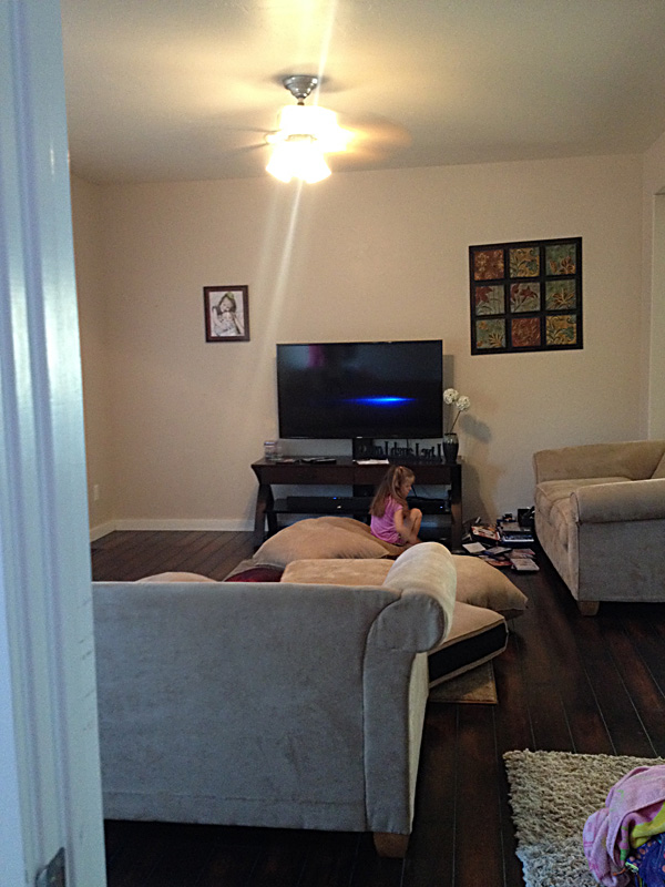
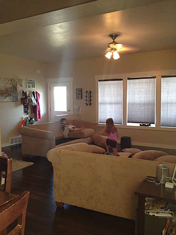
I just love the couch cushions all over the floor! This is real life, and speaks to how the room is used.
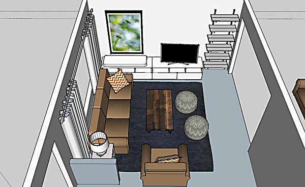
ROOM LAYOUT
My first focus was to address the layout. The half wall by the entrance felt awkward with the couch where it was, but removing the wall was not an option because the flooring was staying in place. Plus, it helped to define the main entrance area. The back of the second sofa faced the dining room, and the result was not very Feng Shui.
Through 3-D SketchUp drawings I was able to convince the client that eliminating one of their sofas would help tremendously with the layout issues, opening up the traffic flow between rooms. (Buying matching sofa/love seat sets are what most of us do—it's what I did—but it is rarely the best design decision). They agreed they could sell one piece and invest instead in a comfortable chair that would fit the space better.
This is where I made a crucial mistake, however. Several days later they came back to me and said this arrangement was NOT going to work for one critical reason. This space was not just a living room, it was their family room and only TV watching space. Comfortable viewing distance was paramount and having the sofa not face the TV was a deal breaker.

Rethinking the layout, we decided we could keep the love seat instead of the sofa (it was rarely used in the old layout and so it was in better condition anyway). They could instead sell the big sofa and buy 2 smaller sized chairs. The shorter sofa plays better with the half wall. This layout dictated a round coffee table for better traffic flow.

Most importantly, no furniture was blocking the entrance and flow into the dining room.
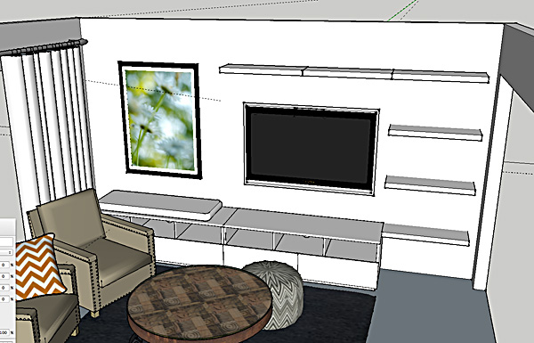
We also explored the option of adding a fireplace to this wall. While it would be a nice addition (and it could still be added at any time), I showed them how they could make this wall more of a focal wall without the expense of putting in a fireplace. The first design incorporated a media cabinet and bookcases. The client is not a knick-knack or clutter person, however, so the idea of filling these shelves made her realize this look wasn't for her.
Ikea is such a great source but here in Montana where we are 2 states away from the nearest store, I usually try to avoid it. In this case, though, it was the perfect solution. Even with high shipping costs, their products are cost effective enough to still make it a good option. We ended up reworking the media wall with some Ikea media pieces and closed storage, mixed with a few handmade wood shelves.

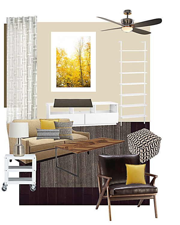
DESIGN PLAN
Since the room was a beige box and the canvas wasn't going to change, and neighboring rooms used very earth tone colors, I chose my design direction to work with that. I brightened up the look of the room by adding more white, which was already present in their trim color.
To level out all of the warm tones, I mixed in warm grays and black and white accents.
They wanted a plan they could incorporate over time, so the room in in progress. I've noted below the things they have purchased thus far with an asterisk (*).
Cotton Geo Lattice Curtains, West Elm*, Chosen for the light and airy quality to brighten up the room, even though they had blinds and didn't need them functionally.
Autumn in New York Art Print, framed, Minted.com* I just love oversized photography and it suited their clean style. This print set the color them for the room. Minted has such a great selection of art prints at fair prices and you can order them already framed which just saves an extra step.
Axis Ceiling Fan, Restoration Hardware Light fixtures can be a hard thing to invest money in, especially when you have fixtures that function just fine, but they can have a huge impact on your room. They are like the jewelry for your room and can finish off the look. In their case, the ceiling fan was useful so we stuck with that. I recommended this more polished version.
The original plan featured this white stairway bookcase and this Chill media console from CB2, but as I mentioned above we changed course and instead purchased components from the Ikea Besta line.*
Boardwalk-Andes Granite Bench Cushion from Crate and Barrel The plan was to use a bench cushion on top of the media console on the window side to create a window seat. The cushion was purchased and later returned and that plan was scrapped. Money better spent elsewhere.
Like on these fabulous pillows: Beasley Yellow, Crate and Barrel, Studded Velvet Pillow in Horseradish from West Elm*, and the Woven Isle Pillow from CB2. These pillows were all important factors in carrying the color story throughout the room and tying in the beige sofa.
Heathered Hand-Loomed Rug from Pottery Barn.* I hope to see this rug in person at some point because the photos look beautiful. I love the texture and the warm gray color to balance out all the brown.
This Chevron Coffee Table from CB2 is a fun choice, but now we will look for similar characteristics in a round option instead.
The Go-cart Rolling Side Table from CB2* is inexpensive and brought the white accents across the room. We also liked the playful industrial style to keep the room feeling casual.
Avery Table Lamp from Crate and Barrel.* They actually didn't immediately order this lamp. It seemed like a lot to spend for just a lamp, and they wanted to wait to see if they could find something else they liked that was less expensive. After awhile they decided to invest in this one, and they love how it looks.
This specific black and white pouf was from Target and is no longer available. However, any type of pouf provides extra casual seating and would be perfect for game nights with the kids. I liked the black and white pattern and texture in this option.
And last but not least, the Cavett Leather Chair from Crate and Barrel. Oh this chair. I am absolutely in love with this chair . . . oops, sorry, that is my drool all over it. But I confess, the clients didn't love it. For them, comfort is key, so they will be looking for something with upholstered arms. They need to keep it on the small side (since there is now a pair of them in the layout) and look for something with legs and space underneath to keep the room from feeling closed in and heavy.
---
I hope you enjoyed this little tour. I have been dragging my feet about posting about some of my design work. Partly because these posts take a lot of time to write. And partly because I like to have photos of the finished room to share. But in reality many projects happen like this—over a long period of time, and for many it takes a long time to get to the stage where you can style and shoot a room. Some may never get there. I do envy those big designers who have the budget to see a project from start to completion, then hire a fancy photographer and stylist to shoot it for their portfolio. I will try to do better about just sharing the process, and hopefully someday I will have some nice glossy after photos to share! Thanks for coming along for the ride, and thanks to these very cool and adventurous clients who have put their faith in me. :)