Dye no more—Montana Inspired Easter Egg

I was approached by Food Network Magazine a few months ago with an interesting challenge—create an Easter egg inspired by my home state. No restrictions on the medium used.  Ack! What to do? The first picture that popped in my head was an elaborately painted landscape with a big bull elk at the center. (Well they contacted the wrong person for that). Instead I proposed something that was a little more me—a modern wheat design that is inspired by the pattern I created for my blog background.  They loved the idea and told me to go for it. 

IMG_0153.jpg

This project caused me no little stress (because Food Network Magazine—doh!) I probably went through a dozen eggs trying to nail the perfect design before I went back to my original idea and just embraced the imperfect, hand-painted quality. 

Trying to paint straight lines on a round egg is... well, crazy. But let me show you a little trick I used. 

I drilled perfectly round holes in each end of the egg first using a Dremel tool. I used these holes to blow out the egg.  Then, I fitted a skewer through each hole and attached mini rubber bands around each end to secure it in place. Then I rested the skewer over a bowl so I could rotate it evenly as I held my brush in place. This also allowed me to paint the egg all the way around and let it dry completely without smudging any of the paint.

IMG_0004.jpg

Now I am thinking the girls and I might be skip the traditional dying and instead try hand-painting our eggs this year. So many possibilities!

Farmhouse kitchen design plan

This farmhouse kitchen has some redeeming qualities. Double ovens (do they really need to work?), two-tone cabinetry, and cushiony baby-knee friendly carpet. Nevertheless, these clients are ready to take this time capsule into the modern generation.

THE BEFORE

IMG_1310.JPG
IMG_1311.JPG
IMG_1312.JPG

LAYOUT PLAN

The U-shape layout is functional, so the plan is to keep the layout mostly the same and eliminate the soffit and take those cabinets to the ceiling. The clients like having 2 ovens, so this plan includes double ovens and a 30" gas range. 

left angle 3D.png

To save a little money on appliances, I offered an alternative that included a wider range combo instead of double ovens. Including some open shelves allows the kitchen to open up more to the next room and create the illusion of a wider space. Which would you choose?

left angle 3D_alt.png

There was not enough room for a stationery island, but there is enough rom for a small mobile island that could be wheeled out of the way as needed. 

front flat.png

The new plan allows for the sink to be centered under the window. (Symmetry is our friend!) We also added two appliance garages flanking either side to hide counter clutter. With no stationery island, instead of pendants we added sconces above the window. Farmhouse style lighting an an apron sink will add the farmhouse focal points to this kitchen.

right angle 3D.png
right flat.png

The right side of the kitchen remained much the same but now accommodates a full-size refrigerator. The client suggested a secretary in place of the old build-in counter area. We have used as many deep drawers throughout as possible. They are so much more functional than deep cupboards!

THE DESIGN PLAN

design board.jpg

The client already had rough sawn wood flooring in their neighboring living area. I suggested they continue this same flooring into their kitchen area to add continuity and warmth to the space. I presented 2 cabinet options to them; White cabinets with a handmade light gray tile backsplash, or a lighter putty gray cabinet with white subway tile. My favorite is the second option. How about you? 

A medium gray countertop, white apron sink, and farmhouse sconces complete the picture. I would add some more wood elements—either through open shelving or as an accent on the hood vent. The client requested a stainless hood, but as an alternative I suggested some wood styles that would warm up the look. I would top off the look with black hardware and accents. 

THE INSPIRATION

I absolutely love this first kitchen. The light gray cabinets are beautiful with the the marble, and I love how they warmed it up with wood elements and aged brass. And that white fixture fits in beautifully. Perhaps marble counter tops are out of the budget, but marble subway tile is more affordable. 

Here is another kitchen with gray countertops, but this one has black hardware. There is still plenty of wood and a natural grass-cloth shade to warm this space up. 

The client offered this as their favorite inspiration photo. There are many custom and budget-blowing features like glazed inset cabinetry with pedestal feet, but the sconces, apron sink, and color scheme can easily be applied to create a similar look!

inspiration kitchen.jpg

Finally, this last kitchen also has so many custom details, but it is a great example of what wood can do to warm up stainless appliances and add character. I like the idea of adding a rustic wood trim to a simple hood vent design. And maybe a custom built appliance garage with some vintage doors... hmmm... food for thought!

from Better Homes and Gardens

from Better Homes and Gardens

This is not a full-service design project, meaning I was involved with the design phase but not the building phase. Hopefully sometime in the future I can be back with some after photos! I hope you have enjoyed a glimpse into the design process!


Master Suite project

Well hi there. I thought I would pop in and tell you what we've been up to on our house. Ready for an update?

We finally started in January of this year on our Master bedroom. This is exciting because this part of the house is the first thing you see when you walk in the front door!

Let me throw some awesome before pictures at ya:

The bedroom:

Of course, we moved our own furniture in, but otherwise left things as is in anticipation of much bigger changes when we were ready.

It took us 7 years to be ready. And trust me. We were very ready to rip out that old carpet. 

Back in this post from June of 2011 I outlined my plans for this portion of the house and shared these floor plans of the Master wing:

It fun to see what I was thinking 6 years ago and how those plans have evolved. As you can see, the space is an awkward shape. I translated these plans in SketchUp for some more specific renderings.

The bedroom had two entrances—a small one through the office and the main door across the entry from our front door. It was always a fun dance to climb out of the shower, peek out the bathroom door to see if the bedroom doors were open, streak across the room to the closet and pray that no one appeared at the front door.

The plan was to:

  • relocate the office entrance to the front of the room and close off the side. 
  • make the office smaller to leave more room for bathroom and closet.
  • eliminate the dark room next to the closet (my grandma was a photographer—we just used it as a glorified storage room)
  • widen the door from the office to the bedroom
  • eliminate the front entrance to the bedroom and add a powder room in this spot. (We later nixed this plan. I decided I didn't really need another bathroom to clean).  
  • Remove the closets on the far wall and add a walk-in closet near the bathroom. 

Here is a closer look at the office. Even though the square footage is smaller, we want to maximize the storage by adding cabinetry. It isn't floor space you really need in an office anyway, but I did have to fight Tom for this real estate. ;)

In the bedroom, removing the closets allowed us to place the bed on the far wall instead of under the window. Instead of adding the powder room, we just ran the wall straight across and added a closet that is accessed on the hall side. We would love to add a fireplace eventually on the wall between the bedroom and bathroom because this room tends to be cold in the winter.

masterbedroom.jpg

The bathroom and closet area was the most challenging space to work out because of it's odd shape. My priorities were to have adequate closet space near the bathroom and a separate room for the toilet so we could still have privacy while the other is using the sinks or closets. Here are a few options I explored:

I thought this last idea had the most potential and flushed it out in 3D. After showing it to my family, however, they felt it was too tight and had too much wasted space. Back to the drawing board.

I thought I might have to resign myself to losing the separate toilet room. This does leave lots of room for everything, including a huge shower.

Then I had an "a-ha" moment. The toilet could go in the same room as the shower and be closed off by a door! In this plan, the shower and closet both would have to be smaller.  The shower is about 48" x 46" in this plan.

As an alternative, the wall could be square with the sink room instead.

Here is a 3D view of this plan. 

(Note: I also moved the wall beside the sinks into the bedroom a bit to leave more room for the vanity. There is a window on this wall that dictates vanity placement. I anticipate doing a lower counter with a stool under the window between the two sinks.)

Construction is done on the office (except cabinetry) and bedroom. Stay tuned for more on that! We knew we would not have time to complete the whole bathroom this winter, so we opted not to demo it. Instead we finished all the walls on the bedroom and office side and hope to tackle the rest when winter comes again. In the meantime, I hope you will weigh in on my bathroom plan options! Am I crazy to insist on a separate space for the toilet?

While we are on the topic of living rooms, I wanted to show you some pillows I made last year. (Actually, Abby did all the sewing. It's great to have kids with skills!)

A friend of mine who went through the same design program as I did at Montana State (Go Bobcats!) did the coolest senior project. She designed fabrics inspired by the prairie where she grew up (she is a farm girl like I am) and sold them on Spoonflower. You can still purchase her designs there on fabric, wallpaper, and wrapping paper. The designs I chose were (front to back) crop rotation, fields of gold, and montana skyscrapers. (The patchwork pillow shown is from Target.)

IMG_0037.jpg

My dream living room

I recently was inspired by Arhaus to share what my dream living room would look like. I don't typically design rooms in my own house from scratch. Usually they evolve over time, one piece at a time as I can afford to make changes. But I've discovered that thinking about my own room design as a whole is a great exercise. It forces me to evaluate what may or may not be working together, and gives me a vision and direction, even if I can't make changes all at once. And normally my budget is pretty limiting, but what if I could erase those restrictions and just think about my ideal space? Challenge accepted!

I had to go back about 3 years to find a decent photo of my living room. I could have taken new photos, but in reality, not much has changed in that time. Here is what I would love to change in my current space:

My end tables are $7 IKEA bargains and it is definitely time to grow out of the college apartment furniture. (Plus I have like 4 side tables in this room. That might be excessive). The sofas are fine, but dated stylistically and more worn than these photos reveal. There are layers peeling off the the leather. The coffee table/ottoman has been practical but is also dated and worn. These are all pieces we purchased in 2005 when we built our house in Utah. That makes them almost 12 years old, so they've lived a pretty good life and I wouldn't feel too guilty about retiring them.

The wall unit on the back wall is my favorite Craig's List find ever, so it definitely stays. With the exception of a little too much clutter back in the corner when I took this photo, I'm pretty happy with that situation. 

I also still enjoy the orange vintage chairs. I think every room needs some vintage pieces layered in to give it some soul. The piano stays, of course. And I still really like the cowhide rug. The shape helps fill in the extra space (because the seating is kind of off center in the room). I also am still happy with a shag type rug. It adds a coziness factor to the room and I the contrast of the lighter color with the dark floors. On the opposite wall, I still love the gray/green paint color (it ties in our rock fireplace colors-below) but I would replace the New York art prints with something more inspired by our current landscape.  

I have had a layout dilemma for this room. Because of its size, I have a U-shaped furniture layout. I can either do two coordinating sofas (like I have currently) along with 2 chairs, or a sectional and 2 chairs. Or I can try a third (harder to pull off) option of two non-matching sofas with 2 chairs. I've drawn up some 3-D layouts to contrast 2 of these options.

This is using not-actual furniture, of course—just representative models. 

Which do you prefer? I think option 1 looks clean and simple but option 2 is tempting. I think it would be more cost effective. 

Since I couldn't make up my mind, I drew up two different mood boards. Welcome to my dream living room!

OPTION 1: SECTIONAL

OPTION 2: NON-MATCHING SOFAS

SOURCES:

a. I changed out this lamp after I brought the mood board together. I thought the room needed a little bling and shine and I adore this Cedar and Moss lamp from Rejuvenation.

b. My current paint color along one wall is Behr Dusty Mountain.

c. I'd love to add some new artwork to this wall that is inspired by our local Montana landscape. In my dream room I would add this 8 Mile Bench panorama by local artist Craig Edwards. In my real room I would probably save money and try to take my own photograph.

d. OPTION 1: This sectional from Rejuvenation looks so yummy and I loved it from the second I first spotted it. (Click through to see better photos-this one doesn't do it justice). It is way out of my price range, but since we are dreaming... (I think it would be difficult to find an affordable alternative which leads us to option 2...)

d. OPTION 2: To coordinate 2 non-matching sofas, I would do one in leather and one in non-leather. I adore this sofa from Arhaus. The upholstery is the perfect warm gray.  I would pair it with this Cavett loveseat from Crate & Barrel. This pairing isn't cheap but together is still less than half of that gorgeous sectional.

e. I have a shag rug but would happily upgrade it to this Marciano rug from Arhaus. So pretty.

f. I have always wanted a low, large, square coffee table. I think the proportions would look fabulous in my large, low-ceilinged-ranch living room. Restoration Hardware has my number on these tables and I am so in love this this Brickmaker's Table.

g. and h.  I love all the textiles from Urban Outfitters, especially this black and white pillow and these killim pillows. The yellow/gray color scheme ties in perfectly with my dining room curtains.

i. Every living room needs a good wool throw to curl up with while you drink your morning coffee. 

j. I bought a Case Study planter for my entry last year (birthday present to myself) and I love it. West Elm has some great options too.

k. These are my own chairs, of course. I included them here for color reference.

l. I desperately need new end tables, and I like the organic look of these reclaimed wood tables from Anthropologie.


So, what do you think? Option 1 or Option 2? What should I save for first?

Design for Fort Benton Chamber of Commerce

Last summer I worked on a new identity for our Fort Benton Chamber of Commerce. What started as a new website design turned into a logo and new brochure design as well. It's always fun to work on a project you are personally connected to and passionate about! 

You can visit the website here.  Fort Benton has a lot to offer our visitors! As the first major trading post in Montana, our little town is chalk full of Native American and early white settler history. Not to mention, the mighty Missouri provides some of the best recreational opportunities around. I highly recommend a river float from Fort Benton down through the White Cliffs, covering virgin territory once traveled by Lewis and Clark. Enjoy a high-class dinner at the historic Grand Union hotel and join in on our Summer Celebration before you embark. 

Blog header design

I recently was given the opportunity to design a blog header for my friend Katie. She had the vision of a watercolor scene that represented landscape and landmarks of the northern Montana prairies where she lives. What a fun challenge!

Katie is a great writer, an accomplished runner, and a valuable farming advocate. It's worth your time to check out her wonderful blog!

A Living Room Refresh

I'd like to share with you another long-distance project I had the privilege of working on. This client was looking for a living room refresh. The problems were common ones: builder beige colors and finishes, too-large, adequate but blah furniture warehouse furniture, and a general lack of design direction. (This is where we all start, isn't it? We buy the furniture that is easily accessible and what we can afford and acquire things slowly, and sometimes it is hard to pull it all together into a cohesive look.)

I was given some before photos and very little design direction. I learned from this project that sometimes people don't know what they want until they see what they DON'T want. It is all about the process. In this case the client's only requests were to keep the original paint color, flooring, and sofas (which were comfy and far from the end of their life).

BEFORE

I just love the couch cushions all over the floor! This is real life, and speaks to how the room is used.

ROOM LAYOUT

My first focus was to address the layout. The half wall by the entrance felt awkward with the couch where it was, but removing the wall was not an option because the flooring was staying in place. Plus, it helped to define the main entrance area. The back of the second sofa faced the dining room, and the result was not very Feng Shui. 

Through 3-D SketchUp drawings I was able to convince the client that eliminating one of their sofas would help tremendously with the layout issues, opening up the traffic flow between rooms. (Buying matching sofa/love seat sets are what most of us do—it's what I did—but it is rarely the best design decision). They agreed they could sell one piece and invest instead in a comfortable chair that would fit the space better.

This is where I made a crucial mistake, however. Several days later they came back to me and said this arrangement was NOT going to work for one critical reason. This space was not just a living room, it was their family room and only TV watching space. Comfortable viewing distance was paramount and having the sofa not face the TV was a deal breaker. 

Rethinking the layout, we decided we could keep the love seat instead of the sofa (it was rarely used in the old layout and so it was in better condition anyway). They could instead sell the big sofa and buy 2 smaller sized chairs. The shorter sofa plays better with the half wall. This layout dictated a round coffee table for better traffic flow. 

Most importantly, no furniture was blocking the entrance and flow into the dining room.

We also explored the option of adding a fireplace to this wall. While it would be a nice addition (and it could still be added at any time), I showed them how they could make this wall more of a focal wall without the expense of putting in a fireplace. The first design incorporated a media cabinet and bookcases. The client is not a knick-knack or clutter person, however, so the idea of filling these shelves made her realize this look wasn't for her.

Ikea is such a great source but here in Montana where we are 2 states away from the nearest store, I usually try to avoid it. In this case, though, it was the perfect solution. Even with high shipping costs, their products are cost effective enough to still make it a good option. We ended up reworking the media wall with some Ikea media pieces and closed storage, mixed with a few handmade wood shelves.

DESIGN PLAN

Since the room was a beige box and the canvas wasn't going to change, and neighboring rooms used very earth tone colors, I chose my design direction to work with that. I brightened up the look of the room by adding more white, which was already present in their trim color.

To level out all of the warm tones, I mixed in warm grays and black and white accents. 

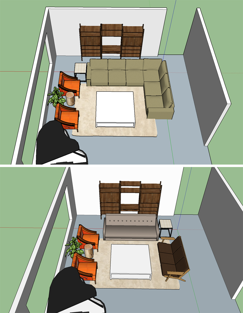
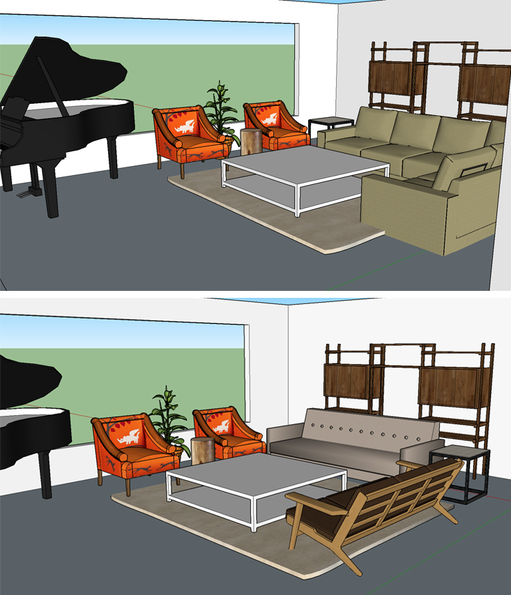
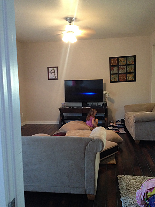
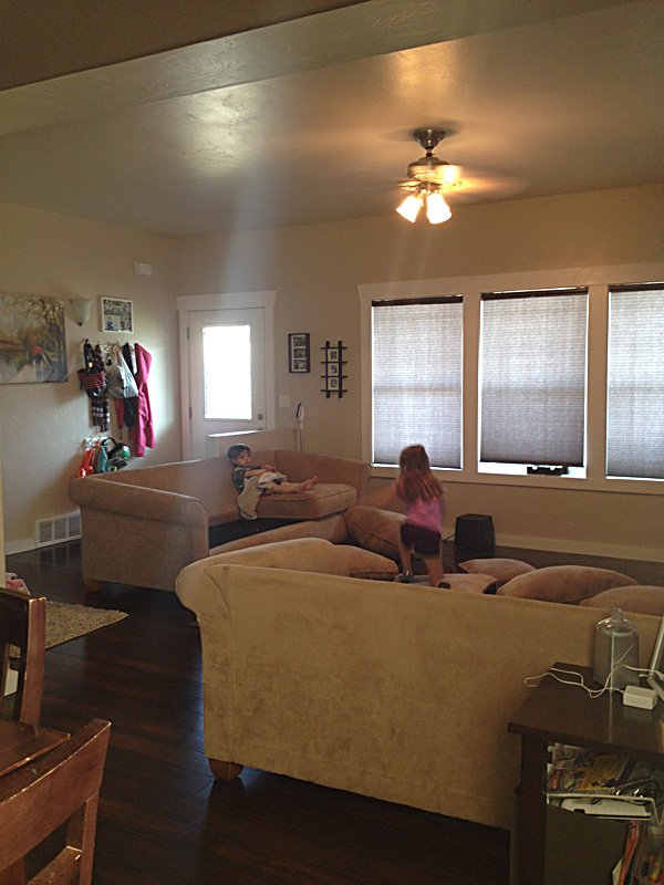
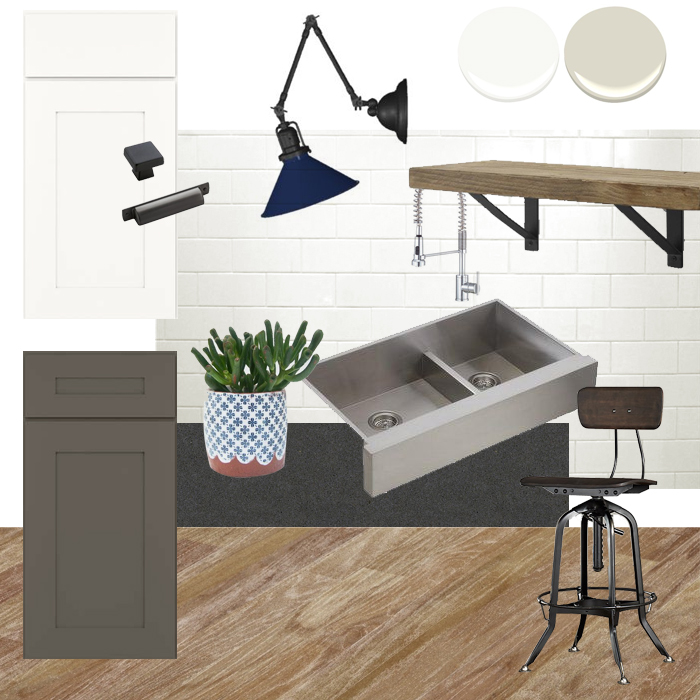
They wanted a plan they could incorporate over time, so the room in in progress. I've noted below the things they have purchased thus far with an asterisk (*). 

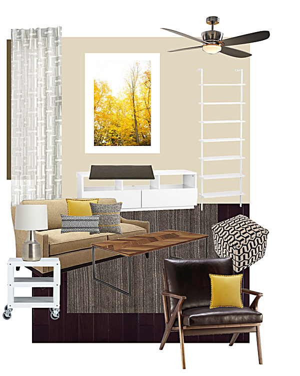
Cotton Geo Lattice Curtains, West Elm*, Chosen for the light and airy quality to brighten up the room, even though they had blinds and didn't need them functionally.

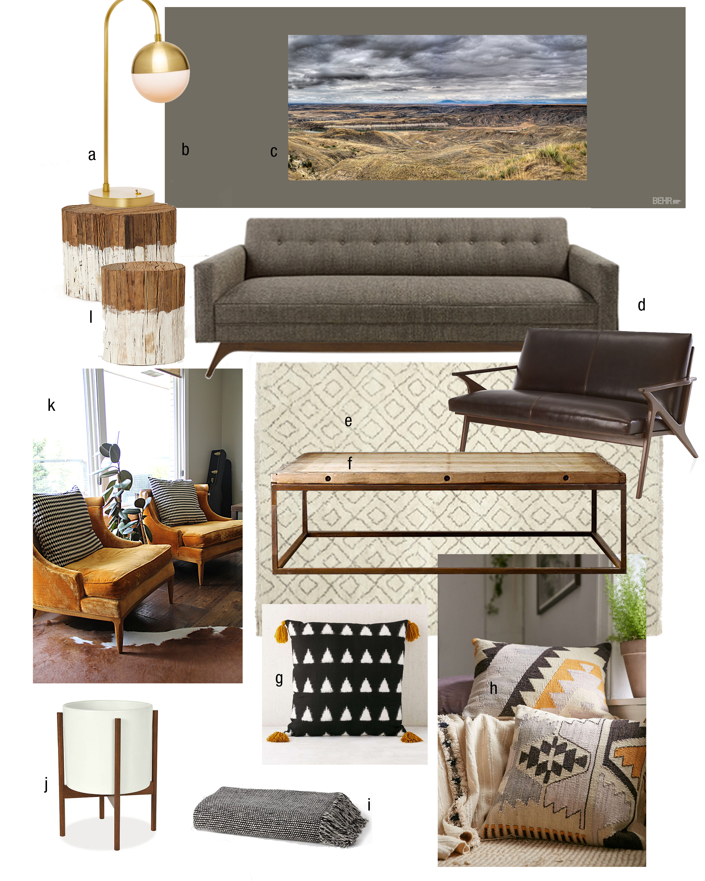
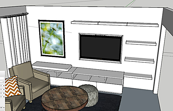
Autumn in New York Art Print, framed, Minted.com*  I just love oversized photography and it suited their clean style. This print set the color them for the room. Minted has such a great selection of art prints at fair prices and you can order them already framed which just saves an extra step.

Axis Ceiling Fan, Restoration Hardware   Light fixtures can be a hard thing to invest money in, especially when you have fixtures that function just fine, but they can have a huge impact on your room. They are like the jewelry for your room and can finish off the look. In their case, the ceiling fan was useful so we stuck with that. I recommended this more polished version. 

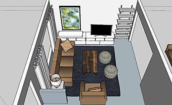
The original plan featured this white stairway bookcase and this Chill media console from CB2, but as I mentioned above we changed course and instead purchased components from the Ikea Besta line.*

Boardwalk-Andes Granite Bench Cushion from Crate and Barrel  The plan was to use a bench cushion on top of the media console on the window side to create a window seat. The cushion was purchased and later returned and that plan was scrapped. Money better spent elsewhere.

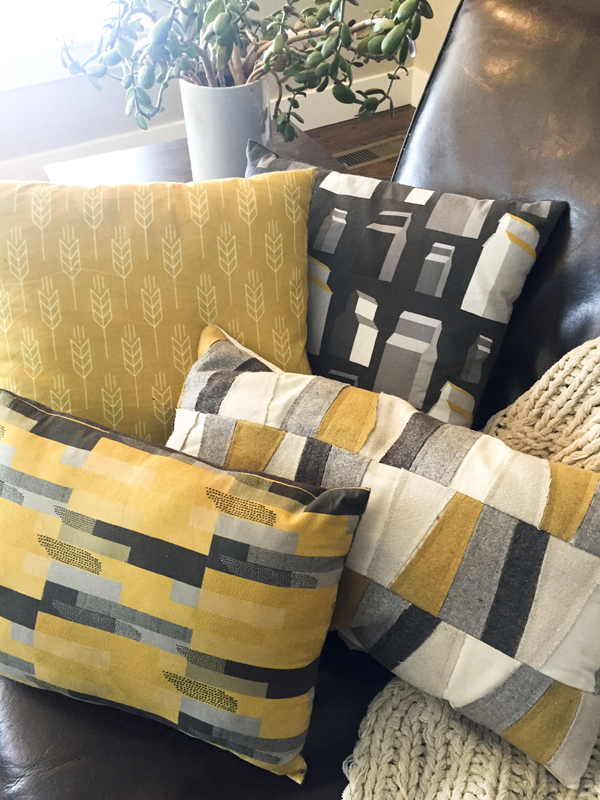
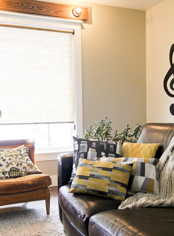
Like on these fabulous pillows: Beasley Yellow, Crate and Barrel, Studded Velvet Pillow in Horseradish from West Elm*, and the Woven Isle Pillow from CB2. These pillows were all important factors in carrying the color story throughout the room and tying in the beige sofa.

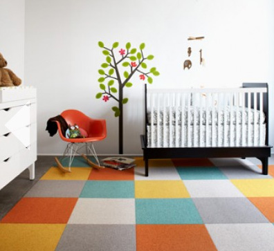
Heathered Hand-Loomed Rug from Pottery Barn.*  I hope to see this rug in person at some point because the photos look beautiful. I love the texture and the warm gray color to balance out all the brown.

This Chevron Coffee Table from CB2 is a fun choice, but now we will look for similar characteristics in a round option instead.

The Go-cart Rolling Side Table from CB2* is inexpensive and brought the white accents across the room. We also liked the playful industrial style to keep the room feeling casual.

Avery Table Lamp from Crate and Barrel.*  They actually didn't immediately order this lamp. It seemed like a lot to spend for just a lamp, and they wanted to wait to see if they could find something else they liked that was less expensive. After awhile they decided to invest in this one, and they love how it looks.

This specific black and white pouf was from Target and is no longer available. However, any type of pouf provides extra casual seating and would be perfect for game nights with the kids. I liked the black and white pattern and texture in this option.

And last but not least, the Cavett Leather Chair from Crate and Barrel. Oh this chair. I am absolutely in love with this chair . . . oops, sorry, that is my drool all over it. But I confess, the clients didn't love it. For them, comfort is key, so they will be looking for something with upholstered arms. They need to keep it on the small side (since there is now a pair of them in the layout) and look for something with legs and space underneath to keep the room from feeling closed in and heavy. 

---

I hope you enjoyed this little tour. I have been dragging my feet about posting about some of my design work. Partly because these posts take a lot of time to write. And partly because I like to have photos of the finished room to share. But in reality many projects happen like this—over a long period of time, and for many it takes a long time to get to the stage where you can style and shoot a room. Some may never get there. I do envy those big designers who have the budget to see a project from start to completion, then hire a fancy photographer and stylist to shoot it for their portfolio. I will try to do better about just sharing the process, and hopefully someday I will have some nice glossy after photos to share! Thanks for coming along for the ride, and thanks to these very cool and adventurous clients who have put their faith in me. :)

Lego table

Since we haven't been making much progress on big projects, I thought I would share a small win instead. Since Christmas our dining room table had been taken over as a Lego playground. The kids were playing with them constantly. And since I think Legos are one of the best toys ever in the way of constructive playing, I didn't want to make them clean them up. 

My solution came by way of an IKEA hack. I had this IKEA Lack coffee table in my storage room because we were no longer using it. I recently tackled a storage room clean-out and had set this table out in my huge pile of ReStore/Goodwill donations. Fortunately, this brainstorm happened in the nick of time. It would make the perfect lego table!

We simply used some 1x2 boards we had laying around and cut them to make 3 separate compartments. (The Barbie set above is a different brand so it is nice to have separate areas so the sets won't be mixed up.) The boards prevent the pieces from scattering all the over the floor! Tom screwed them into the table from the bottom. We left them unfinished and the blend nicely with the table finish. 

The shelf underneath can hold containers of their other sets. Simple, easy, perfect! I even have a glass top to set over the top if I ever want to use it without the dividers.

We put the table in the basement, but already noticed the girls don't play with them as much. Since it is easy to move I think we will bring it up to our living room or into the girls bedrooms. At least it isn't on our dining room table!


Christmas cards and more

( SPOILER ALERT - CHRISTMAS CARDS REVEALED BELOW )

So, I guess if you usually get a card from us and would rather see it in person first, you might want to skip this post. Otherwise, carry on. :)

I tried a new vendor for my Christmas cards this year, and I am so happy with them I just had to share. I recently ordered an art print for a client through Minted, and realized I really liked their card designs as well. So when the time came to order mine this year, I payed them another visit.

See, the cool thing about Minted is that they take submissions from designers anywhere. Those designs are voted on and then sold on Minted. Most of their options are modern and clean, which appeals to me. I had no problem finding lots of options I liked. The problem was narrowing it down.

But the BEST THING about it? They print the recipient address on your envelopes for you!! For free! (Well, I should be clear. You pay a little bit more up front on Minted than through some other popular sources, but their quality is way better.) Yes, that is in bold because I think it is SO IDEAL and I want to shout it from the rooftops.

I absolutely LOVED this service—both for how it looked and the time it saved me! I usually print my address file onto labels. This time I just uploaded my addresses in an Excel file when I ordered my cards and they printed them right on the envelopes. They look so professional! 

I also payed a little bit extra to upgrade the paper to a thick recycled stock (because I'm a design nerd and care a great deal about the quality of the paper) and ordered skinny wrap return address labels that you see above.

We just snapped our family photo last minute with a self-timer in our living room. And sometimes I like the simple black and white snapshots the best anyway!

I know it's a little late to be posting about this, but in case you are behind the eight ball this year (me, many times) and haven't yet ordered your cards, I highly recommend Minted

DISCLAIMER: The links above are affiliate links, meaning if you click on the links in this post to go to Minted and place an order, I will get a small kickback from them in turn for sending them your business. Good for them, good for me, and good for you. Win, win, right?


I didn't always take the time to do Christmas cards, but I started probably 7 or 8 years ago and have done them ever since. I love connecting with people that way and really love getting cards in the mail also. As a designer I feel the pressure to make it amazing every year, but I'm leaning every year to more simplicity. Not just in my Christmas cards. This year we did 90% of our shopping online and it was wonderful. Let the stores come to me, I say. UPS and Fed Ex are getting tired of our gravel roads, I'm sure. 

We also kept our decor simple. But I do love a few twinkling lights to brighten up the dark winter nights. The girls love it too and do most of the decorating work! Here is our festive little corner of our living room:

We also love all the fun Christmas programs. In addition to their regular school programs, the girls each danced in our community holiday concert, and again at the retirement home here in Fort Benton. 

IMG_0116.jpg
IMG_0139.jpg

Look at Eva and her beautifully pointed toes! I am so proud that in spite of her shy nature she willingly goes up on stage and fearlessly performs. All my girls adore dancing and it is so good for their coordination and strength. 

I hope you are all able to simplify and enjoy your own holiday season. Tidings of Comfort and Joy!

kitchen with a mountain view

Since I put my shingle out as a designer I've had a few inquiries about doing long-distance projects. With a couple such projects under my belt now, I can confidently say it works quite well! Today I am excited to show you a project where our primary communication was via e-mail. This client found me when my kitchen was featured on Apartment TherapyThey do live in-state, so I was able to visit the home once before the plan was presented, and again when the project was complete to take "after" photos. 

The client provided measurements and photos of her kitchen. We discussed her wants and needs in depth through a series of questions and answers via e-mail. At that point we had the opportunity to meet in person before I finalized their plan.

existing kit layout.jpg
BEFORE

BEFORE

The original kitchen in this late-century ranch home felt dark and closed in. It's single window faced north, and the built in florescent box light topped the hit list. The red sink dictated the color scheme and limited their decorating options. The cabinets were showing wear and many of the doors wouldn't close properly. Otherwise, the galley style layout worked well for them. They weren't interested in opening the wall (left) to the living room, however there was an unused back door at the other end that left some opportunity to add additional space. (There is also a sliding door in the dining room that provides access to the back yard.)

I provided two 3-D layouts to them to help them visualize annexing the back door and pantry space into the kitchen area. Both designs called for removing the short end walls on either side that were non-load bearing, eliminating the soffits and florescent light box and installing can lights.

The first layout involved removing the back door all together, removing all upper cabinets on the north wall, and adding extra windows to make the kitchen feel lighter and larger and maximize their beautiful mountain views.

A second option showed the dividing walls removed but the back door still in place. The old pantry closet was replaced with cabinets to unify it with the kitchen. The single window was maintained and open shelves were added to replace the lost storage of upper cabinets.

On the opposite side, the appliance locations were maintained to save costs. We also explored the idea of glass upper cabinets to increase the light and airy feel.

The renderings helped them visualize the end result and in the end they took the leap that would give them the biggest impact—removing the back door and expanding the window. 

While their electric cooktop functioned okay, they eventually decided to make the switch to a gas stove. They opted for a range instead of a cooktop, adding a range above and eliminating the wall oven/microwave combo which provided them with extra counter space. They found a spot for their microwave by borrowing space from a coat closet and creating a niche just to the right of the refrigerator.

I also provided them with a mood board to help them make design selections since I was not involved in the shopping and sourcing portion of the project. 

I recommended a two-tone cabinet color scheme with a warm white on top and gray on the bottom. The light color would keep things light and bright, and the gray would add variety and durability to the cabinets that get the most wear. The design also included white subway tile and beautiful feature sconces from Rejuvenation above the windows. She had expressed a love for cobalt and had an inspiration photo with a stunning cobalt gas stove. I suggested that lighting might be a great opportunity to bring the color in without making a permanent commitment. (Shades could easily be swapped out later). I was thrilled that they decided to adopt the lights in their design, though they did opt for a more classic and neutral option (also from Rejuvenation).

Because their kitchen footprint expanded, they would need to either match their existing oak and refinish the entire space or replace it with something new. Their contractor found them a deal on reclaimed wood from an old gymnasium, so they chose to replace it. I love the character and warmth the new floor brings to the space.

Now for the reveal:

BEFORE

BEFORE

AFTER

AFTER

BEFORE

BEFORE

AFTER

AFTER

BEFORE

BEFORE

AFTER

AFTER

BEFORE

BEFORE

AFTER

AFTER

BEFORE

BEFORE

AFTER

AFTER

BEFORE

BEFORE

AFTER

AFTER

A few fun features in their new kitchen:

I hope you enjoyed this tour! I certainly enjoyed working on this project and seeing the transformation when it was finished. Do let me know if you have any questions about sources and I will try to track down the info for you.


a new business venture

I've had a little something up my sleeve for awhile now, and I'm excited—and a little nervous—to finally shout it from the rooftops. 

Since our move from Utah 3 years ago I have really enjoyed taking a break from working and focusing instead on settling in to our new life on the farm, staying home to raise our little Eva, and working on our home remodeling project. 

Though our house projects are nowhere near complete, now that Eva is going to preschool it seems like a great time to ease back into the workforce. (Not that staying at home is any less work—I've definitely learned that! Cheers to the hard-working-stay-at-home-mom workforce!) In any case, I have missed designing and am anxious to take on a few projects for others.


Although I will always love doing Graphic Design and intend to keep doing so, this time I am really excited to add interior design to my repertoire, and maybe even some photography! (I am not a professional photographer—I've worked with enough amazing photographers to know my limitations, but I do enjoy doing creative photography projects and can hold my own.)

From a young age I have had a huge passion for interiors. It was only because our in-state colleges had dropped their Interior Design programs that I decided to branch out into Graphic Design instead. I have no regrets, and I believe my Graphic Design training was great for both disciplines. Since I have moved back to Montana it has been the Interior Design opportunities that have fallen into to my lap, so I am just embracing the chance to do what I have always loved! 

My portfolio mostly consists of projects in my house at this time, as well as few display rooms I designed while working at Stampin' Up! I hope that will soon change, however, as I have been hired by my first client to help remodel her entire house. We have been working on this project for several months and I hope to be able to show you more as we near completion by the end of the year!

I hope you will take the time to check out my website www.joellynclarkdesigns.com, and recommend me to your friends!

Colter Wayne

I recently had the privilege of practicing my photo "skillz" (ha) on my newest, most adorable neighbor. This is Colter Wayne, my cousin's new baby boy. And boy is is he irresistible. All these new baby boys might be making me want my own little boy a teensy weensy bit . . .  Nah, just kidding. I'm quite happy to give them lots of cuddles and then hand them back to their mommies.


There is no doubt this little guy is going to be raised all country, is there? :)

photo book annual

My photo book arrived, and I'm thrilled with it!


It has been a goal of mine for a LONG time to do photo book annuals for our family photos, but it seemed like it always fell to the back burner. So to finally get one finished and printed feels SO GOOD. I'm freshly motivated to start on 2012, and also to work backwards until I have one for every year that we've been married. (Back to 1997!) When I get back to about 2004 I was shooting film, so my photos will need to all be scanned. I also didn't take as many photos back then, and I don't remember as many details to write about, so I may combine multiple years in one book.

I ordered my book from Shutterfly, and it was about $68 (including shipping) which I think is a screaming deal when you think about how much it used to cost to buy film and develop a year's worth of photos. Or how much it would cost in supplies (or time) to scrapbook. I had a 50% off promotion code, and an additional $10 off code that kept the cost down significantly. 

My book is 12 x 12 (ideal for fitting lots of pictures on a page) and 72 pages long. I used a lot of the photos and text from my blog rather than starting from scratch, which helped a ton with the time factor.

Here are a few of the layouts:

I set up a limited number of grids and font styles to follow and kept the design pretty simple from there. I intend to keep this same design theme going through all the books I do, so I wanted it to be pretty clean and classic.

Shutterfly has some really nice templates to follow, but I wanted complete design flexibility so I built mine in InDesign and uploaded full pages as JPEGs. The production isn't absolutely perfect—the spine text doesn't align perfectly for example, and I've found a couple of small design errors already, but I know from my years of catalog publishing that they are never perfect. 

Overall it turned out awesome and my family is already having a ball reliving our last year. I can't wait to start the next one—wish me luck!


a narrowboat home

I thought it might be nice to take a break from kitchen remodeling today.

When Tom and I took our trip to England back in August of 2009, one of our favorite days was spent touring Stratford Upon Avon. There is an old canal system that runs through much of the England countryside that was originally developed for cargo transportation. Once the railroad system came to England, however, the canals were no longer used and filled with silt. Later on they were dredged out and the miniature hand-operated lock systems were restored. Now the canals are used for recreation and are full of these narrow barge boats that people vacation or retire on.


We were intrigued by these boats and enjoyed visiting with a gentleman who was a permanent resident on his. Many of them were decorated on the outside with plants and yard furniture. 

So you can imagine I was excited to see a narrowboat featured recently on Desire to Inspire. It is fun to see what one looks like on the inside!

Can you imagine living like this? It probably isn't much different than living in an RV. But if you ask me, I think this would so much cooler than an Airstream. On the water! In England!

First 2 images, Montana Prairie Tales. All other images, Dominique Brown via Desire to Inspire. Click through to see more. 

FLOR inspiration

I'm tired of thinking about lighting so let's change the subject.

Today as I was drinking my lunch (yes drinking—the Pioneer Woman slim fast shake—which is tasty but ridiculously cold when it is minus 15 outside . . . shiver) I was flipping through the FLOR catalog that came to me in the mail this week. Whether or not you are in to their rug tiles, you can't deny their photo styling is fan-freaking-tastic. 

Hello, yummy Chesterfield and amazing red leather chair. That pop of red is so great against the warm neutrals. I would love to find a colorful vintage chair to mix in with my own blah brown living room furniture.

Hello, chair of my dreams.

Neutrals with contrast—my favorite look.

Oversized artwork in black and white.

Great color scheme!

Too bold for me and yet so cool.

I need to find this dresser for a bathroom vanity.


And last but not least, who doesn't love a good houndstooth?

All images from FLOR.com

Vacation ABCs

When we left for our vacation last week, we of course told the girls' teachers they would be missing a few days of school. Sarah's teacher kindly told her not to worry about doing any makeup work, but requested that she bring back photos to share with the class.

So in addition to the sea shell mementos we put together, we decided to make the photo sharing into a little project as well. Since Sarah is in Kindergarten and working on all of her letter sounds, I thought it would be fun to find something to take a picture of starting with every letter and turn it into a book. Both girls got into the game and it turned out to be a fun way to document our trip. Here are the pages of our book, and a recap of our vacation all in one:


Now you know your ABCs . . . I mean, now you know all the details of our trip. I've sent the pages to Shutterfly to make a little paperback book. So much more fun than sending a few photos to school, don't you think? 

Missoni

Who needs Missoni when you can have authentic 60's chevron goodness? Just sayin'.


I inherited these afghans with the house. I liked them enough not to get rid of them, but not enough to display them. Now I might have to reconsider. 

Doing things the hard way

I've been accused more than once in my life of doing things the hard way. (My mom says I get it from my dad.)  My mom is usually the one helping me with the kids while I bury myself in a project that takes twice as long as I plan. Tom is the one urging me to go to bed when I burn the midnight oil working on something.

This time it was the cupcakes I made for my card class:

Pistachio and White Chocolate Cupcakes from scratch. The recipe is from Cupcakes, Cupcakes, and more Cupcakes, an adorable cookbook that was a gift from my in-laws for Christmas. I'd been dying to try a recipe from it, and this is the one that caught my eye. Only I couldn't find pistachio paste. (No gourmet grocery stores here!) So I had to make it. I shelled the pistachios, boiled them to release the skins, peeled them, and ran them through the blender with oil and water to make a purée. It was successful, but it took good long while. And then I discovered the recipe only made 12 cupcakes, so I had to make a second batch.

They were good. But they weren't amazing. Maybe it was just that the flavor didn't quite match up with the effort.

I also had to make cupcakes for Abby's school Valentine party. Fortunately I took an easier route and used a mix.

But I couldn't just use a mix. I found this recipe from Heather Bailey to fancy them up. I did buy the frosting. Cut me some slack.

And then, amongst much encouragement from Tom to just buy them already, I made Valentine cards with the girls. 40 of them.

We made these cute little matchbook notebooks. And for the boys pink was a bit too girlie, so we found this cool basketball and football paper in my stash. Each card had a sucker stapled to it and was hand-signed by the girls.

I'm not sure what compels me to take the hard road. Heaven knows I am busy enough and constantly complaining about not getting enough done. Is it about the glory? I hope not. I'd like to think it is about the process. Here is a photo of the girls working on the cards with me:

Both of them said the night before Valentine's day was the Best Day Ever. I think they are just like me and I wouldn't give up these memories for the world.

card class

Saturday I am hosting a card class, and today I spent the afternoon coming up with the cards we are going to make.

All supplies are from Stampin' Up!

I decided to do this class once a quarter as a way to keep ties with my old company. It is so fun to spend the afternoon stamping, and I always end up wondering why I don't do it more often!

Anyway, if you live in the area and would like to come, let me know!